Putting the “New” in NeuroID: A Fresh Look for the Future of Identity
NeuroID has a new look. As our product, people, and prospects have evolved, it was time for our visual brand to also catch up. We are thrilled to present our new logo, colors, website, and even a slight modification to our written name, from Neuro-ID to NeuroID (thanks, hyphen, it’s been great!).
How It Started: 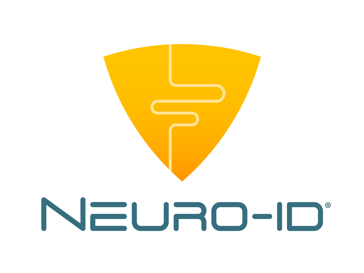
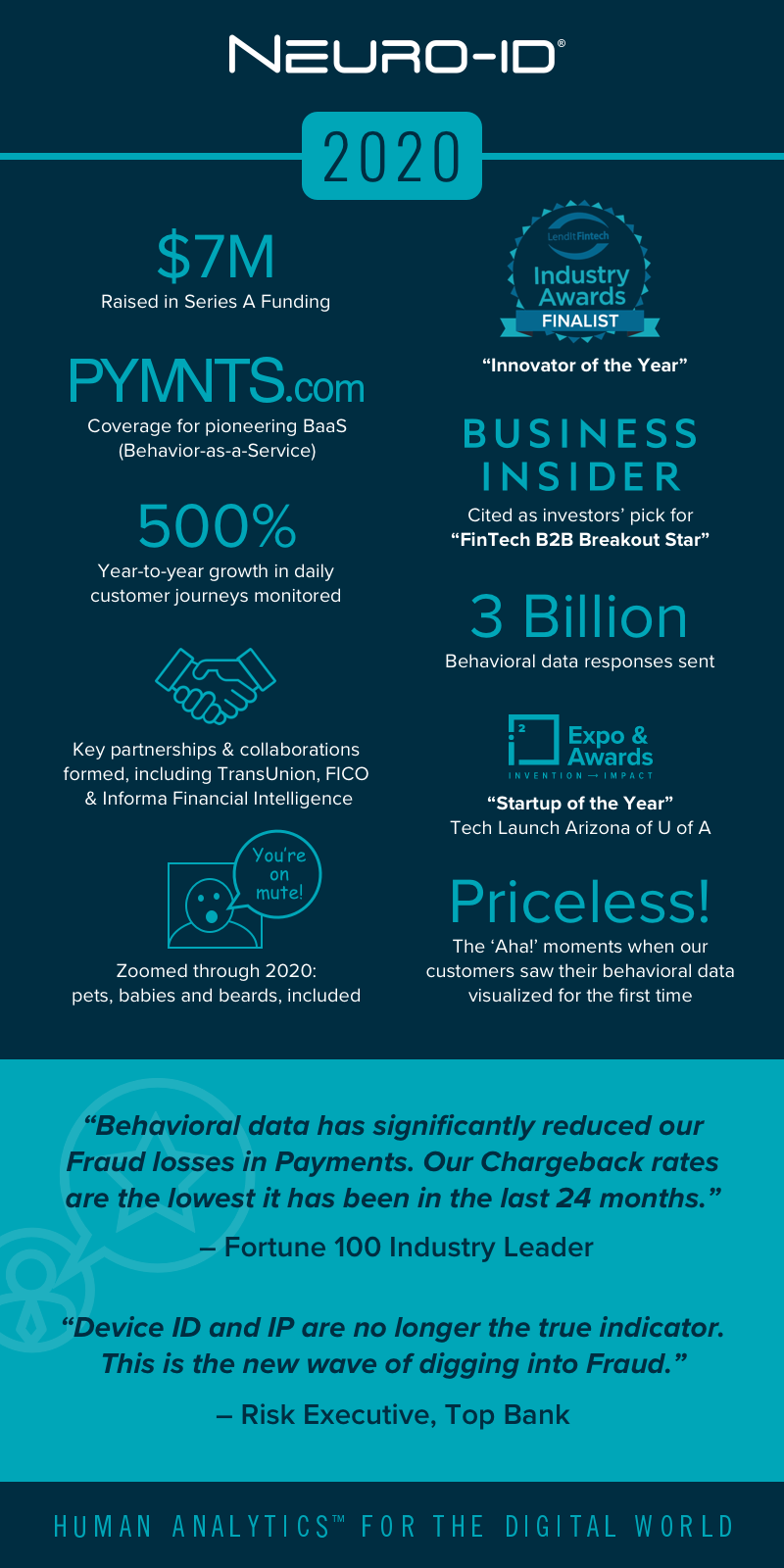
NeuroID was founded in 2014 as a behavior-as-a-service software that simplified access to behavioral data and revealed key insights into online applicants’ intent. Our original look and logo were created off that idea, a homage to blending three types of data into one, novel solution.
How It’s Going: 
Over the past 8 years, our customers have evolved, our products and capabilities have grown, our team has matured, and our impact on the world of identity has been so resounding that it begged for introspection. We knew it was time for our corporate visual identity to incorporate all of those changes. Our mission as a company is to create the future of identity: this rebrand is a symbol of that bright future.
What We Stand For
Right now, the world is in the midst of a Digital Identity Crisis. Fake accounts are opened everyday, across every digital platform. Some of these fake accounts could be innocuous (albeit annoying; try opening the comments on any Instagram post from a major account) but most are downright nefarious, especially when it comes to account opening for financial institutions.
Fraud is out of control and your PII is all over the internet. So when someone grafts your social security number into a synthetic identity and applies for a new credit card, there are real, painful consequences both for the consumer and the lending business.
Here’s the paradox to that problem—traditional fraud stacks rely on this very PII to flag fraudsters. Think about that. The instruments themselves that are used to detect fraud are cross-referencing this PII, which often appears legitimate, to run checks. Organized fraud rings have more PII at their disposal than ever before, and are using this PII to create identities, open accounts, and defraud. Modern problems require modern solutions. Enter NeuroID.
A Modern Look for an Innovative Approach
Earlier this year, we began working on our new brand and asking the soul-searching questions integral to that journey. How could we align our products, culture, customers, and visual representation? We knew we wanted something simple, something clean, clear, and intentionally high-contrast. Our product stands out from the crowd (even as it monitors the crowd) and our goal is to clarify decision-making: we wanted a clean look that would match that streamlined approach.
Our new logo was the first step towards translating our vision into a visual. Paul Rand, the foundational voice of modern logo design, wrote that a logo is “a flag, a signature, an escutcheon, a street sign.” We knew we wanted our ‘flag’ to have deep, precise meaning. We thought about every detail: for example, the off-color dot represents a break from the status quo, an anomalous detection, and a point of focus for identity leaders to know where to look. Our product was founded based on patented neuroscience, and our new logo recognizes that in the rough shape of a cerebrum.
Bright Colors for a Bright Future
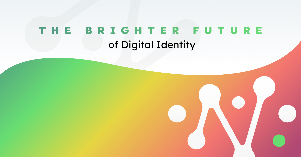
We had the logo: now we needed to fill in the rest of the visual identity, including color palette. We knew that for this brand to feel modern and clean, it needed a minimal palette. I’m a big fan of primarily using neutrals and accenting with sharp, popping gradients in small doses. NeuroID segments an applicant pool by behavior, and so using a stoplight color spectrum in a way that hadn’t been done before was an exciting way for us to include small punches of bright color on an otherwise neutral (black/white) background. Ultimately, the portion of our gradient spectrum that would be used most was the green gradient, which aligns symbolically with our fundamental goal of helping to ‘greenlight’ genuine users.
Typography was a clear choice. We ended up going with Lexend as our primary font, which is widely available, professional, and modern.
To Hyphen or Not to Hyphen
This was the last, but maybe easiest decision to make. Neuro-ID was originally created with “ID” standing for “Intent Detect.” The ID has two meanings now: both the original Intent Detect, which nods to behavior, and ID in the traditional abbreviation for identity. We knew we didn’t want to drop the ID, but we also knew that many of our customers do drop the hyphen naturally. As in every part of our business, we want to meet our customers’ needs: Neuro-ID became NeuroID. Internally, we also call ourselves Neuroids . . . so that private in-joke across the team also helps represent our culture.
The Future of Digital Identity
We’re excited to enter this new future of our identity, while bringing our clients and partners into the future of digital identity. Explore our website to get a better feel for our new look and industry-redefining approach to solving the Digital Identity Crisis.

